ShopDreamUp AI ArtDreamUp
Deviation Actions


Suggested Deviants


Suggested Collections


You Might Like…


Featured in Groups


Description
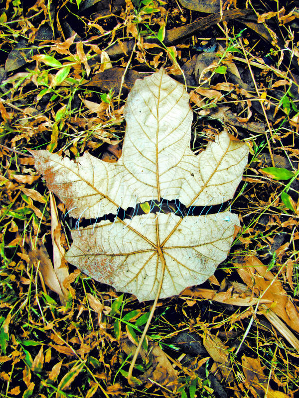
This is inspired from a somewhat similar photograph I had seen somewhere, I can't seem to recall, or I would have credited the resp. artist.
*"This photo is taking part in a "Autumn Colours contest" organized by *
*
*Entry for Autumn Contest [link]
For
I would like a critique on the following points:
1.Concept
2. the colors
3. Composition
*"This photo is taking part in a "Autumn Colours contest" organized by
**Entry for
For
I would like a critique on the following points:
1.Concept
2. the colors
3. Composition
Image size
2736x3648px 5.08 MB
Make
Canon
Model
Canon PowerShot SX120 IS
Shutter Speed
1/60 second
Aperture
F/3.5
Focal Length
6 mm
ISO Speed
80
Date Taken
Nov 12, 2010, 11:42:29 AM
Sensor Size
4mm
© 2010 - 2024 quarterbacker
Comments11
Join the community to add your comment. Already a deviant? Log In
Hi.
I’m writing this in response to the critique request you sent to <img class="avatar" src="a.deviantart.net/avatars/c/r/c…" alt="
 " title="Critique-It"/>.
You said in your artist’s comments that this photograph was inspired by a similar picture. I believe I haven’t seen a picture like this one before, so from my point of view the concept is quite original. However, its implementation could be improved in my opinion, and I’d like to point out how.
The first thing I’d like to address is the composition. Obviously the camera was pretty much directly above the center of the leaf when you took this picture. The resulting composition is very flat – there is no sense of depth in this image. In my opinion a lower camera angle would have resulted in a more interesting composition. Alternatively, you could have fixed the leaf on the branch of a tree, which has two advantages: You can include the branch in the picture, and the leaf can easily be separated from the background by selecting an appropriate aperture. By the way, you could try making a square crop of this picture – it might look more pleasing than the current aspect ratio.
The colors in this image look quite natural. Of course it would have been nice to have a little more yellow or maybe even red in this picture to support the autumn concept. Have you considered to selectively desaturate the image, leaving only the leaf and the thread colored? That would serve to separate the leaf from the ground, thereby putting emphasis on the concept. Anyway, if your intent was to produce natural colors, you succeeded. The contrast also looks pretty good, although I think there are a few burnt spots (black due to insufficient exposure or too much contrast).
Focus and sharpness are fine in my opinion, and the depth of field is not really an issue for this kind of composition. But there is something which I find disturbing right in the middle of the picture: The big, not so pretty dA logo. Watermarking your images is certainly not a bad idea, but I’m sure you can come up with something a bit more subtle than the dA watermark.
I hope I was able to give you a fresh perspective and provide you with some useful suggestions. In case you have any questions, feel free to ask me.
*Argolith